HELLO
MARLON
Thanks for reaching out to have your Instagram page Re-Styled. While AMD is still quite popular for its distinct style on Instagram, in light of the new equipment investment you’re about to make, I have a few concepts of how we can execute a 2025 refresher.
What's working?
-
AMD’s distinct brand look is consistent and easily identifiable.
-
Due to its offerings and unique page style, AMD has gained popularity online.
What's not working?
-
While the page is uniform, it is static and, as a result, not as dynamic or fluid as it could be.
-
The video styles are repetitive.
-
Camera quality needs to be higher.
It’s important to strike a balance between what works and what doesn’t. While we need the brand to remain strong and identifiable, we also need to mix things up so that the aesthetic stays captivating, no matter what. Here’s what I have in mind:
PROPOSED PHOTO STYLING
Let’s have three alternating ways of styling the grid that can be used in any order to maintain the energetic aesthetic. Each style consists of a grid of three posts, and grids can be used interchangeably. Here’s what each grid style can look like (don’t worry, I’ll provide all editable files):
Grid 1:
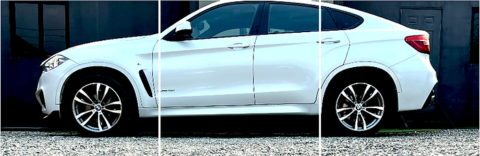
Post with logo in the center, images of the car on the left and right. It’s important that the photos on the right and left show the car from different angles.

Things to note in this grid format:
-
The logo image has a ripped paper element in the top right and lower left corners. On top of these ripped papers, I’ve included images of the same vehicle at different angles, but I’ve lowered the opacity so it achieves a faded look, which adds some dimmension.
-
Note the version of the car’s logo is metallic. The logos of all the vehicles you present need to be in their metallic version—it should be easy to find them on Google, but let me know if you have any trouble.
-
For photos on the left, place logo at bottom left, and for photos that will be posted on the right, place logo I bottom right corner.
Grid 2:
Close-up interior shot as the center photo. The photos on the left and right should show head-on shots, whether back, front, or both. No angular shots should be used in this grid format; the pictures have to be taken head-on from the front or back only. Again, for photos on the left, place logo at bottom left, and for photos that will be posted on the right, place logo I bottom right corner.

Grid 3:
Full-width photos. We already have these every few posts or so, but I’m putting it back because it works well. My only concern here is that the photos need to have a sharper look; making them more high contrast can achieve this. The new camera equipment will assist here as well.
ORIGINAL:

HIGH CONTRAST EDIT:
Here are the settings I used in Photoshop; these specifics aren’t set in stone and will vary based on many factors, such as natural lighting and the time of day the photos were taken. Use your discretion.


PHOTO/REEL COVER RULES
To break up the current styling I’ve come up with some new rules to ensure the aesthetic looks different than what we currently have. This is a complete change from the original rules:
-
No text on images whatsoever. Data like the make, model and year should be placed in the caption only. Never on the image.

-
Never post the same two photo angles in the same grid row. If one image is showing the car from the left hand side, the other should show the right and vice versa.

-
Photos must be high contrast. In your photo editing software, utilizing the Curves, Exposure, or Brightness/Contrast features can give the photos more. A nice high contrast can result in a sharper look.

-
Additional Note: Try to include the sky and the ground in the same shots where possible. I see where this is already being done; I’m encouraging you to continue including this as it helps with contrast.

Once we implement this, we should achieve a completely new look. However, it’s important to adhere to the requirements I put forth. I speak more on this in the adherence section.

PROPOSED VIDEO STYLING
Currently, the videos on the page have solid angles and good transitions. I like the way the interior and exterior of each vehicle are displayed; it gives the buyer an overall good feel of the car’s quality beforehand.
The trouble is the videos all look the same. This is what creates the feeling of monotony. The direction is not bad, but we do need to be more dynamic. Here’s how we can do that:
-
I think the videos can include more motion. We can include a person opening the doors and stepping out or going into the cars. We can also include shots of the trunks being open, the push-to-start button being pressed, etc.
-
It would be good if we also had shots of the vehicles being driven in different environments if possible.
-
In addition to that, we can get more diverse with the transitions. The current transitions work, but I think there's more we can do, such as color grading.
Here’s some inspiration:
Sample - Driving in New Environments
Sample - Motion: Trunk being open, focus on seat adjustment, display screen etc
Varying transitions - color grading, push-to-start-logo fade-in, etc.
HIGHLIGHT IMAGES
An easily overlooked section of the page is the highlights section. Highlight covers play a role in how attractive a page is. Some people like to use bulky icons, as in the case of your competitors—Griffiths Motor Sales (see below).

But what I find works best is uniformity. The text below the highlight itself describes what’s inside, so you can get away with using something smoother as the actual cover. Here’s what I propose:

HIGHLIGHT IMAGES

A concern I have going forward is adherence to the guidelines presented. This is extremely important if your goal is to continue to be the trendsetter in your space. Each aesthetic has rules, and they have to be adhered to in order to achieve the desired outcome.
I’ll need a quick meeting with your content creator to discuss what kind of tools they have, such as Photoshop, etc. I’ll need to understand what they have access to, as that will affect their ability to execute the styles I’ve put forward.
ADHERENCE
BUILDING RECOMMENDATIONS
I did try two looks for your new location’s building. Of the two options, I recommend the full black building as its aesthetic is smoother and more aligned with the original branch’s—ensuring brand continuity. The contrast against the concrete finish at the Mandeville location is also strong. It provides a nice balance and works well with the brand colors as well.
Recommended Option:

Other Option:

In Conclusion...
In conclusion, this proposal is designed to address the key areas where AMD can elevate its Instagram presence while maintaining its distinct brand identity. By introducing dynamic photo and video styles, improving the highlight covers, and ensuring adherence to the proposed guidelines, AMD can solidify its position as a trendsetter in the automotive space.
The recommendations provided, including those for the new office building, align with the brand’s vision and ensure continuity across locations. I’m confident that these strategies will enhance the visual appeal and engagement of AMD’s social media, driving even greater success in 2025 and beyond.
What's Next?
Fees:
My fee for this will range between JMD 60k–75k depending on the level of support I’ll have to provide with your current content creator. I’ll be able to better assess this once we meet.
Your Feedback:
I’ll need your thoughts as well, Marlon, on what I’ve put forward. Does it resonate? What do you think? Leave your feedback in the section below:


Feedback / Approval
Leave your feedback or queries, and confirm approval below: